
Categories
Featured
€12.00
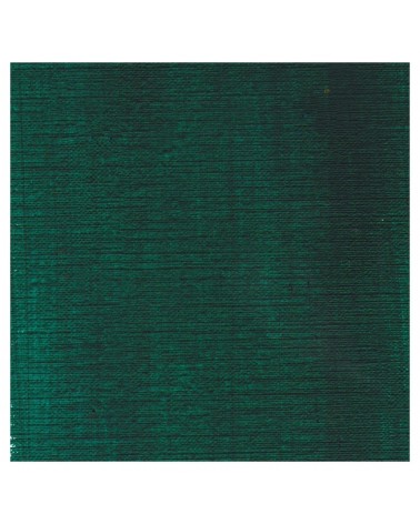
It's a deep brownish green.
€6.95
€27.79
Product available with different options
€12.00
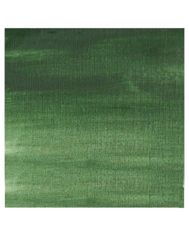
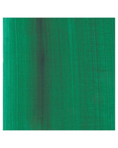
It's a beautifull green useful in producing glazes when diluted.
€6.95
€26.00
This colour is more Transparent and less dull than chromium oxide green. Emerald green produces splendidly luminous green when mixed with cadmium yellow. Landscapists and some portraitists prefer it because his undertone is less vivid than the phtalo green.
€8.45
The flagship color in metallic colors. Very appreciated by watercolorists looking for fantasy.
€16.00
This Transparent iron oxyde with a orangey undertone is excellent for producing luminous and warm glazes.
€7.40
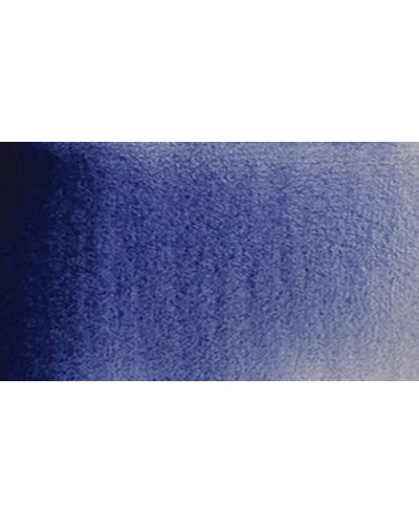
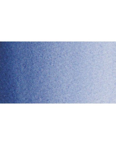
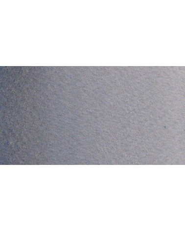
Gorgeous unique shade of gray blue.
€8.00
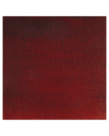
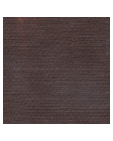
A reddish brown more Opaque and intense than the burnt umber
€8.45
Un bleu à la teinte unique et légèrement iridescent. Il ravira les aquarellistes qui apprécient les effets et la granulation.
€8.45
I was inspired by the surprising reflections of a semi-precious stone: apatite.
This blue is grainy and iridescent. It is part of the 2022 Happy Precious Year collection.
€8.00
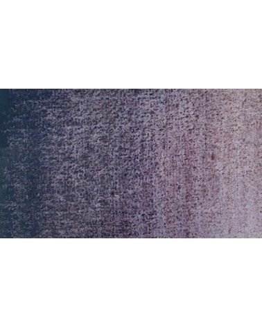
A intense cold brown with a violet shade.
€8.00
A beautifull warm brown with a yellowish undertone
€8.45
The base of this color is a very soft blue. Diluted well, this color gives a bluish white ideal for painting snow for example.
€5.30
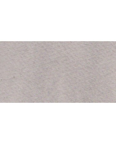
Beautiful subtle very light gray for light shadows and drapes.
€8.00
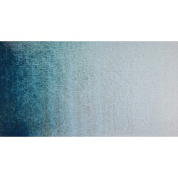
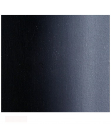
A deep cool blue black.
€16.00
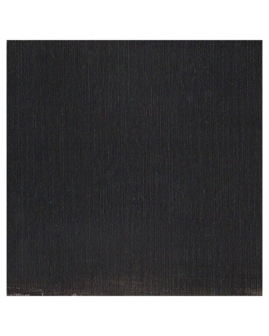
It's a strong neutral black.
€8.45
The base of this color is a silver gray.
The addition of a silver pearlescent pigment strengthens the silvery note of the shade and brings to mind a pewter gray.
€8.45
Ametrine is a quartz born from the union of citrine and amethyst which gives it very interesting reflections. I was inspired by the color of this mineral to create this purple which joins "other colors of the 2022 "Happy Precious Year" collection.
This color is grainy and iridescent.
€8.00
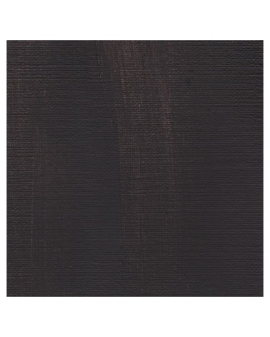
A warm deep black. Mixed with yellow ochre we obtain a warm black and mixed with ultramarine blue it produces a cold black.
€6.95
€6.95
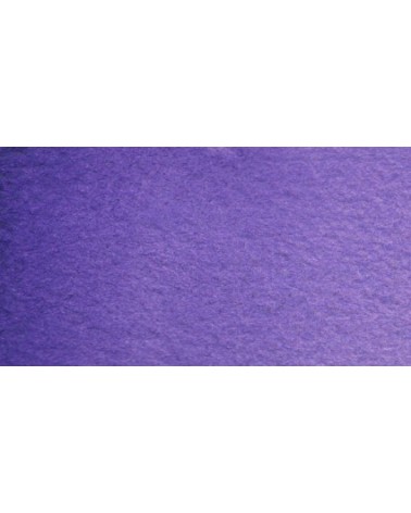
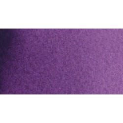
Very beautiful violet with a beautiful purity of tone. It belongs to the overseas family. Its particularity is to naturally granulate.
€6.95
Magnificent red which turns brown. More transparent than burnt Sienna and less grainy, it can perfectly replace it for watercolorists who prefer a more transparent and reddish tone.
€6.95
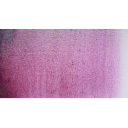
Dark mauve which can be lightened with Isaro pink and nuanced with overseas blue for example.
€6.95
Very beautiful light mauve mono pigmentary and therefore a beautiful purity of tone. It can be lightened with Isaro pink and darkens with ultramarine blue or phthalo blue for example.
€6.95
€6.95
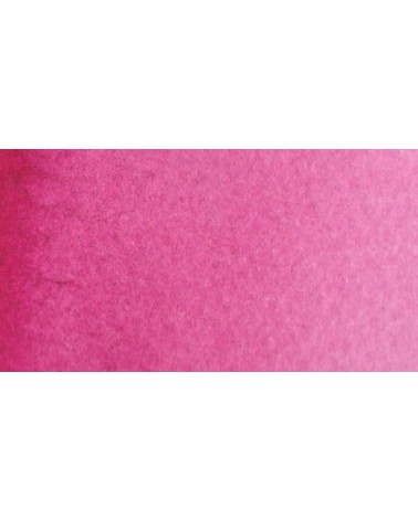
This color can be used as the primary color. It is a bright pink, which forms with the yellows beautiful oranges and with the blue magnificent mauves.
€6.95
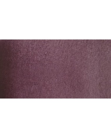
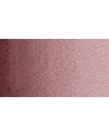
Your dark purple tending to brown. Pure it is of an interesting tone. It also comes in composite colors like sepia brown or Van Dijck brown.
€8.45
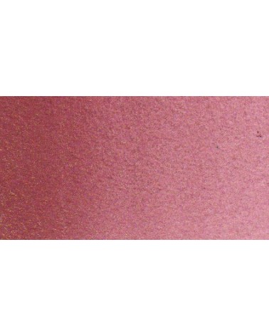
It is a metallic color. This tone is singular, with a mauve shade dotted with copper highlights.
€3.95
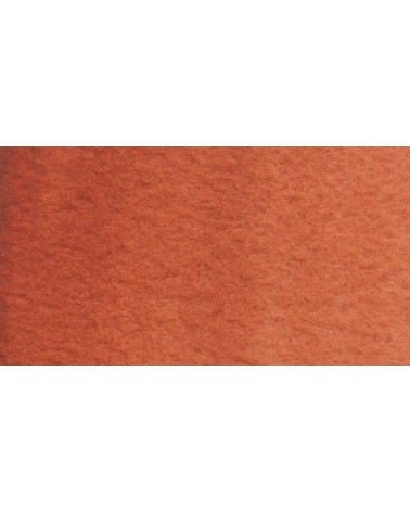
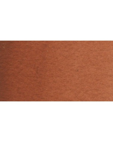
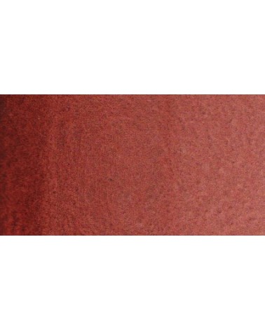
Very beautiful brown, slightly red. For watercolorists looking for uniform washes, March Brown may be preferred over natural soils.
€7.40
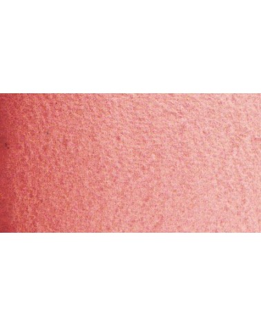
This red is part of the range of metallic colors. Like all the metallic colors that I have created, its nuance is singular.
€8.45
Ametrine is a quartz born from the union of citrine and amethyst which gives it very interesting reflections. I was inspired by the color of this mineral to create this purple which joins "other colors of the 2022 "Happy Precious Year" collection.
This color is grainy and iridescent.
€7.40
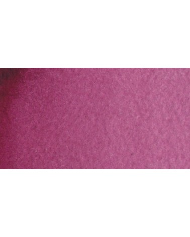
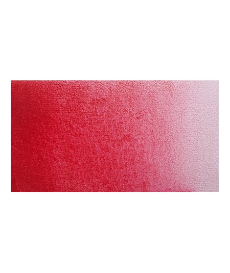
Very beautiful dark red tending to burgundy.
€6.95
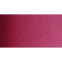
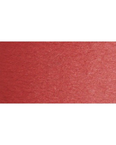
This red is a very dark red. I find it magnificent in mixture with chartreuse yellow in particular because it forms magnificent autumn tones.
I find that its nuance makes one think of the "old crimson alizarines" of which it does not have the lack of stability.