
Categories
Featured
Active filters
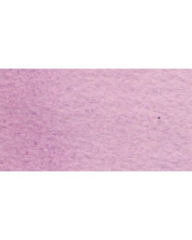
€7.40
A very discreet and interesting pink especially to bring softness to certain floral compositions.
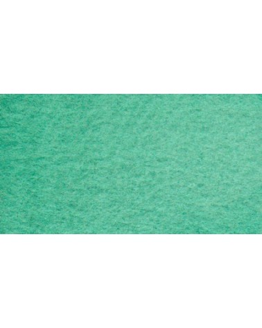
€7.40
Very beautiful green tone less dynamic than phthalo green. The emerald green is bluish.
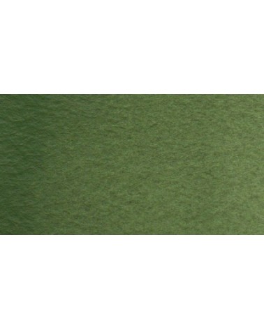
€6.55
Very beautiful earthy green and mono pigment.
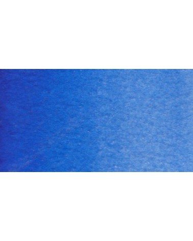
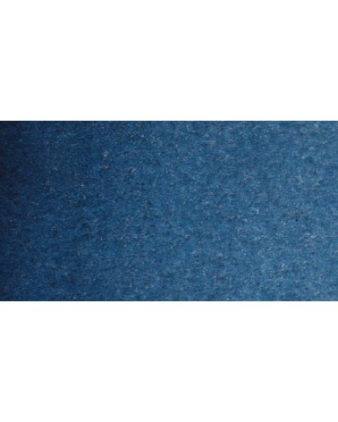
€5.30
Magnificent blue with an underlying shade of mauve. Very useful for composing magnificent mauves, especially with quinacridones like Isaro pink for example.
With black or burnt sienna, it makes it possible to obtain very beautiful Payne grays and with burnt umber to create a beautiful indigo.
€7.40
Real cobalt blue with a great purity of tone. Bright and close to primary blue. We can define it as the most blue of blues because it does not draw on green (like Prussian blue) or red (like overseas).
€5.30
Close shade of natural indigo.
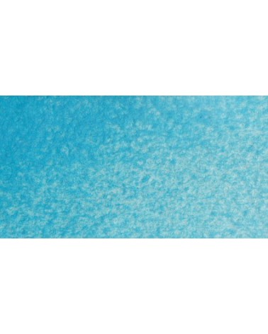
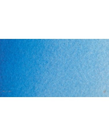
€7.40
Very beautiful light blue, which pulls slightly towards green. Particularly suitable for working the sky.
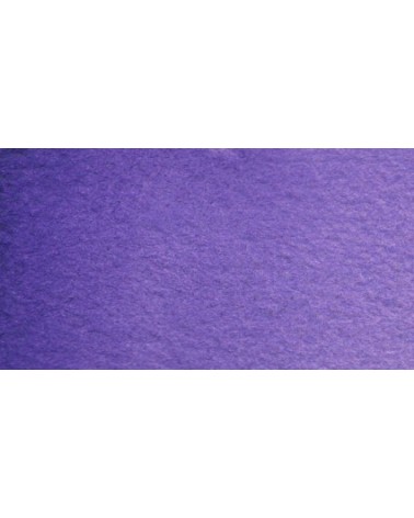
€6.95
Very beautiful violet with a beautiful purity of tone. It belongs to the overseas family. Its particularity is to naturally granulate.
€6.95
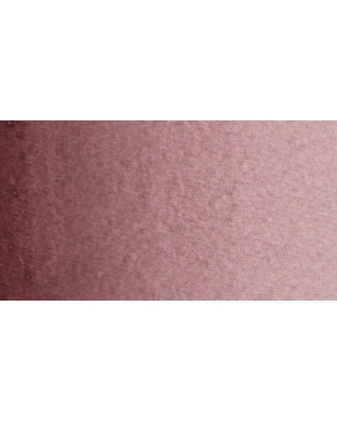
Your dark purple tending to brown. Pure it is of an interesting tone. It also comes in composite colors like sepia brown or Van Dijck brown.
€3.95
Very beautiful brown, slightly red. For watercolorists looking for uniform washes, March Brown may be preferred over natural soils.
€7.40
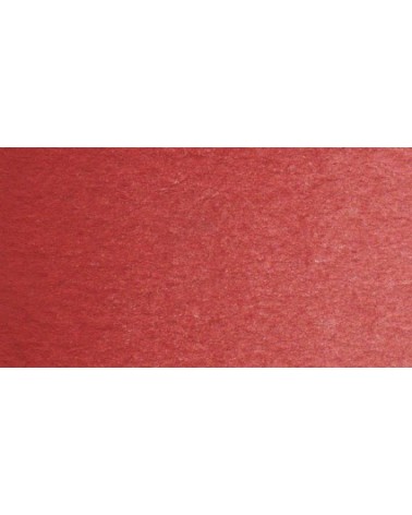
Very beautiful dark red tending to burgundy.
€7.40
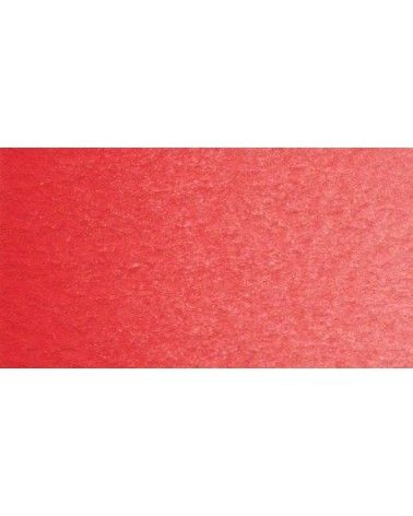
This red has a great purity of tone. It draws very slightly on the yellow.
€5.30
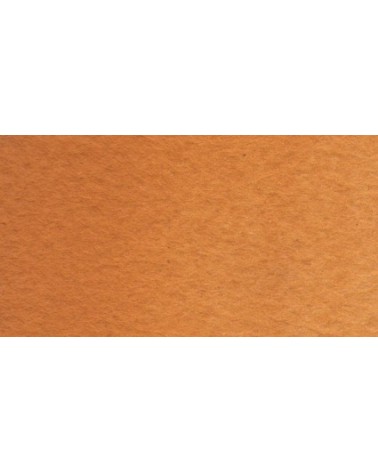
Earthy orange but nevertheless bright.
€7.40
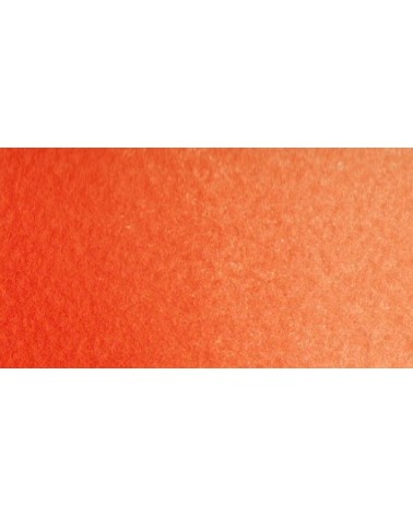
Bright orange. This color is monopigmentary which gives it a very beautiful purity of tone. Due to its greater transparency, pyrrole orange may be preferred.
€7.40
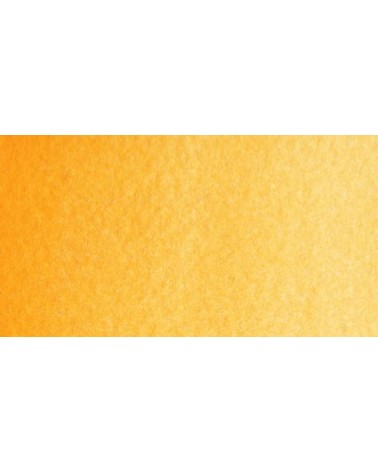
Magnificent yellow-orange very bright and a beautiful purity of tone.
Its more marked opacity than organic yellows (Isaro Yellow light, dark and Indian) can hold back its use, however well mastered it is quite magnificent. It is undeniably one of the colors in my range that appeals to the majority of watercolorists.
€7.40
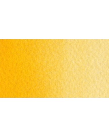
Bright yellow with great purity of tone.
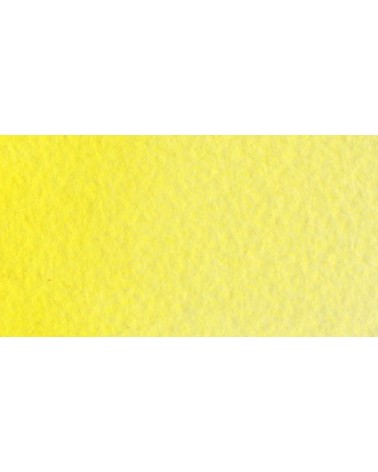
€7.40
Magnificent pale yellow with underlying shade of green, very bright and bright yellow.
€6.55
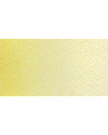
A very soft, slightly pastel yellow.
€3.95
Very beautiful yellow, earthy and bright. Very useful on the palette.

€7.40

€5.30
Very interesting Color to create "pastel" touch by mixing with other colors.
€5.30
Very beautiful brown with a green shade that characterizes real natural shade earth. I draw attention to the fact that this gray earth is naturally very little coloring.
€5.30
Beautiful earthy yellow.
€5.30
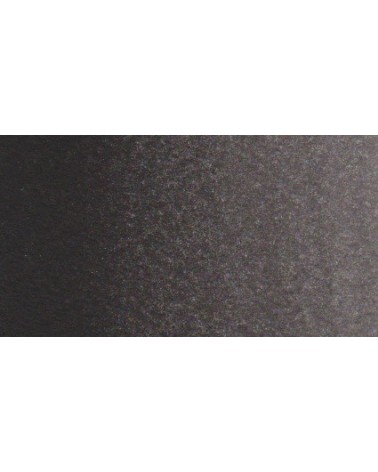
This black can be useful for certain mixtures. For example, by combining it with ultramarine blue to obtain Payne gray or mauve iron oxide or Venice red to obtain Van Dijck brown, if we add a little ocher we obtain the sepia color.
€3.95
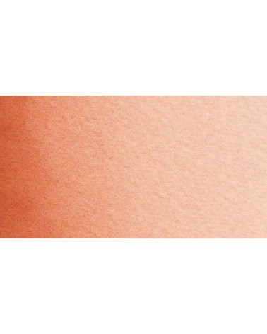
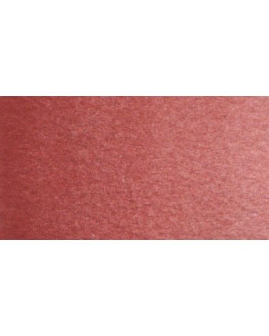
Very beautiful brick red, with an underlying shade of orange-yellow.
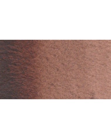
€5.30
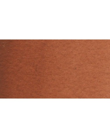
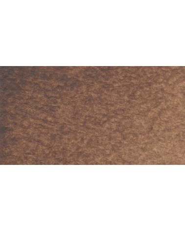
Dark and warm brown. Interesting color for dark your shades.
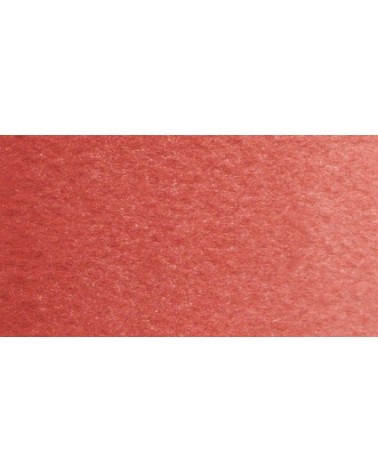
€3.95
Very good brick red tone, with an underlying pink shade. Despite its relative opacity, this well-mastered color is appreciated by watercolorists.
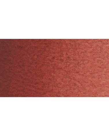
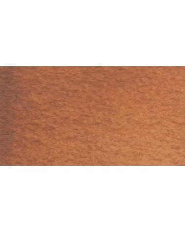
€5.30
Very beautiful earth turning red. This color is, in my opinion, essential on the palette as it is rich in mixture. With blues, for example, burnt Sienna is a nice range of grays. With the reds, she creates "brick red" colors.