
Categories
Featured
Active filters
€7.40
€7.40
€7.40
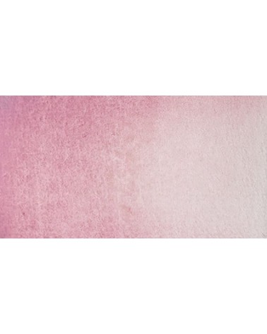
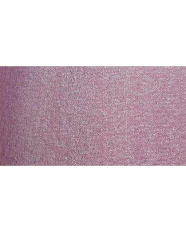
A very discreet and interesting pink especially to bring softness to certain floral compositions.
€8.45
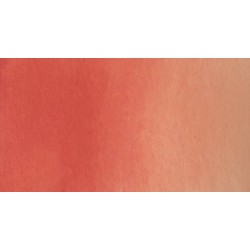
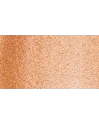
Rose navré et légèrement orange
€8.45
€7.40
€6.55
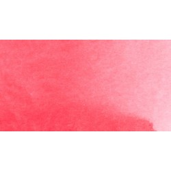
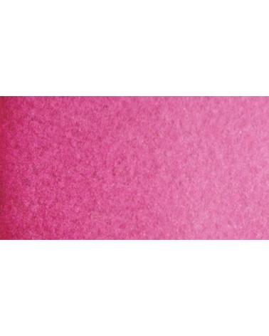
Magnificent bright color. Indispensable in many mixtures and in particular to compose, with the blues, a large number of mauves.
With the reds it makes it possible to obtain "cherry red" or "raspberry red" tones.
In my opinion, it is one of the very useful colors on a palette.
€7.40
A very discreet and interesting pink especially to bring softness to certain floral compositions.
€8.45
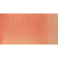
Rose légèrement nacré
€8.45
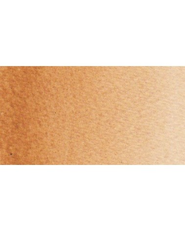
Golden color, to be used for certain highlights.
€8.45
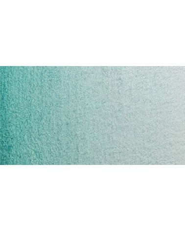
Turquoise légèrement irisé
€5.30
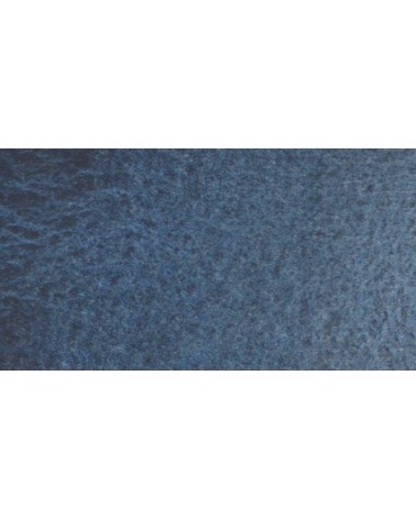
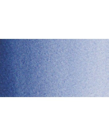
Very nice cold, deep gray, turning blue. Useful as a contrast color.
€8.45
The flagship color in metallic colors. Very appreciated by watercolorists looking for fantasy.
€8.45
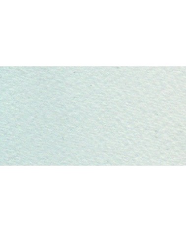
The base of this color is a very soft blue. Diluted well, this color gives a bluish white ideal for painting snow for example.
€5.30
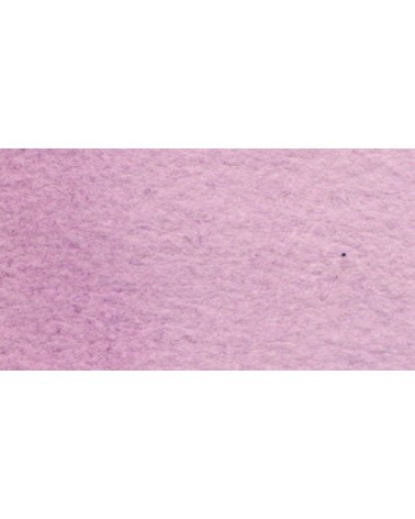
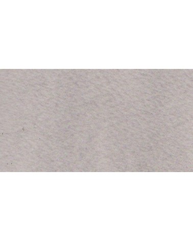
Beautiful subtle very light gray for light shadows and drapes.
€8.45
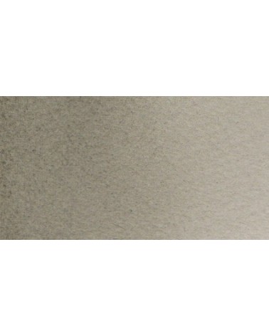
The base of this color is a silver gray.
The addition of a silver pearlescent pigment strengthens the silvery note of the shade and brings to mind a pewter gray.
€8.45
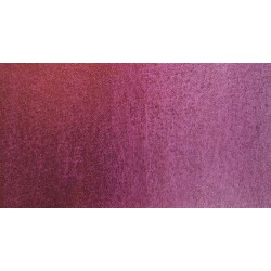
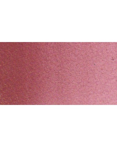
It is a metallic color. This tone is singular, with a mauve shade dotted with copper highlights.
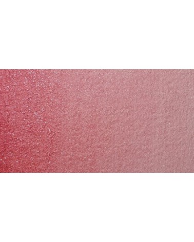
€7.40
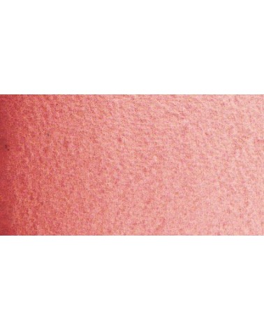
This red is part of the range of metallic colors. Like all the metallic colors that I have created, its nuance is singular.
€8.45
This color is one of the metallic colors that I created to give a little fantasy to the palette of artists who want it.