
Categories
Featured
Active filters
€7.40
€7.40
€7.40
A very discreet and interesting pink especially to bring softness to certain floral compositions.
€8.45
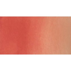
Rose navré et légèrement orange
€8.45
€6.55
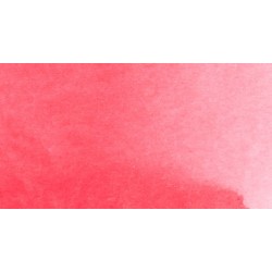
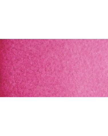
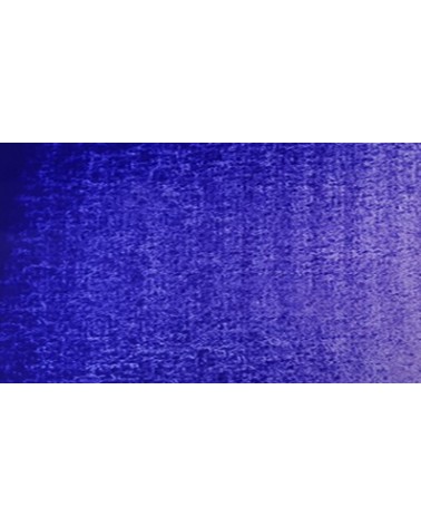
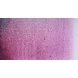
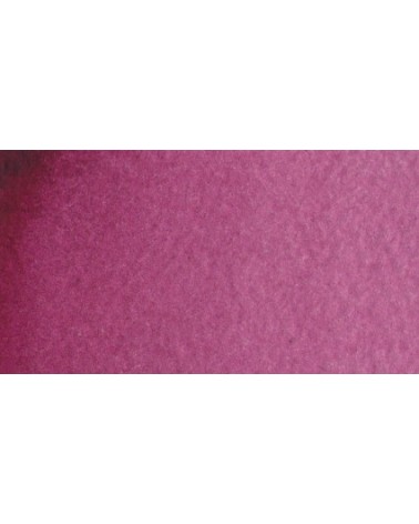
Magnificent bright color. Indispensable in many mixtures and in particular to compose, with the blues, a large number of mauves.
With the reds it makes it possible to obtain "cherry red" or "raspberry red" tones.
In my opinion, it is one of the very useful colors on a palette.
€8.45
Rose nacré clair.
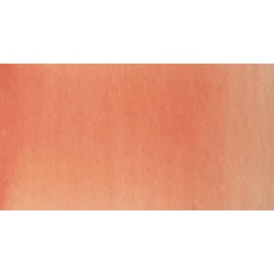
Un rose très clair et légèrement nacré
€8.45
Rose légèrement nacré
€8.45
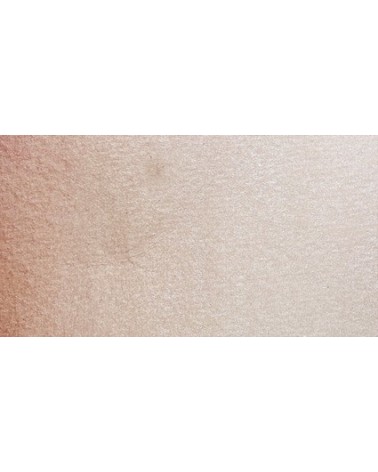
Golden color, to be used for certain highlights.
€8.45
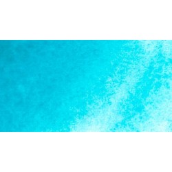
Turquoise légèrement irisé

€8.45
€6.95
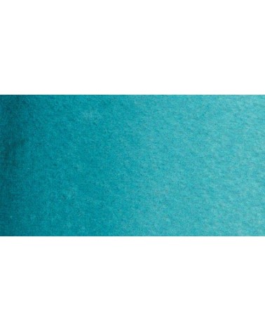
Based on blue and phthalo green, this turquoise is nuanced at will with blue or green.
€6.55
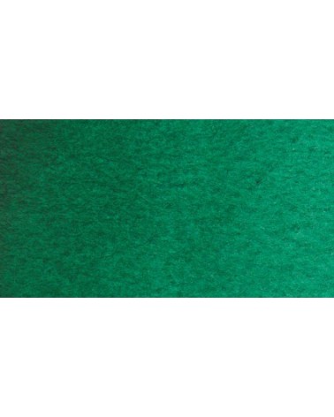
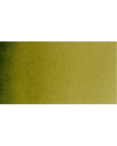
Very beautiful green, turning blue. When mixed with phthalo blue, it gives a very nice range of turquoises. With the yellows to obtain a very wide range of greens. With the earths of earthy greens and with the burnt umber a dark green.
€6.55
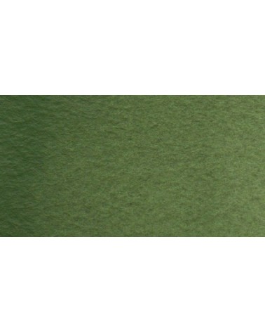
Very beautiful earthy green and mono pigment.
€6.95
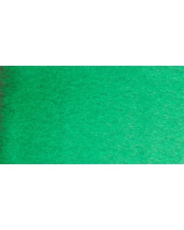
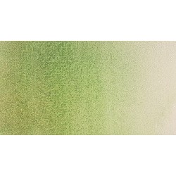
Magnificent bright green with an underlying shade of yellow.
€6.95
Vert Sapin
PG36 + PY165
€6.95
€7.40
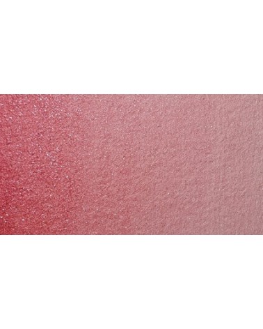
Singular and grainy green color.
€8.45
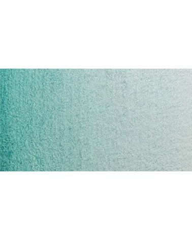
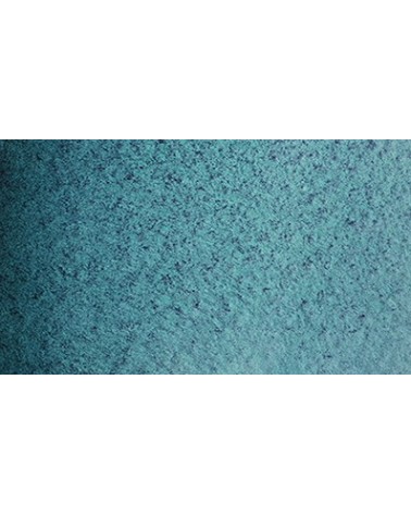
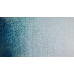
I was inspired by the surprising reflections of a semi-precious stone: apatite.
This blue is grainy and iridescent. It is part of the 2022 Happy Precious Year collection.
€7.40
€7.40
€6.55
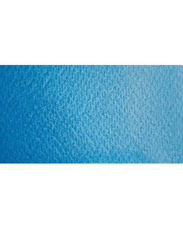
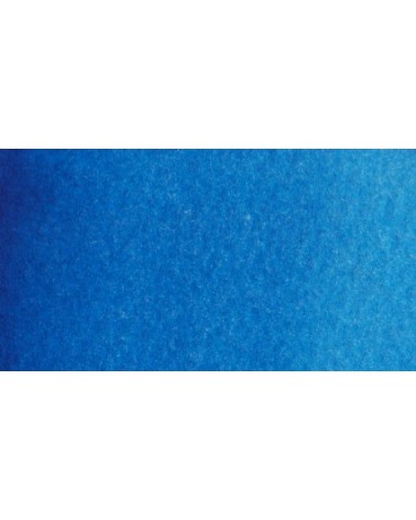
Very beautiful blue with a shade having an underlying green tone. Very bright and frank.
With phthalo green it forms very beautiful turquoise. With the yellows of the beautiful greens. With the ocher of the more muted greens and with the pink or the purple Isaro a beautiful range of mauves.
€5.30
Close shade of natural indigo.
€5.30
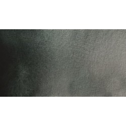
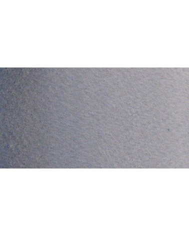
Very nice cold, deep gray, turning blue. Useful as a contrast color.
€5.30
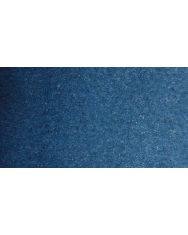
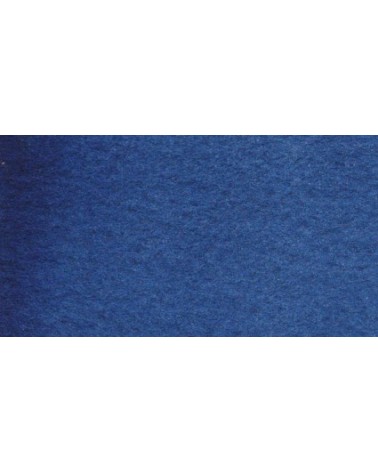
Dark blue with an underlying green hue. This blue is very useful for creating greens, it is actually the blue of greens.
€6.95
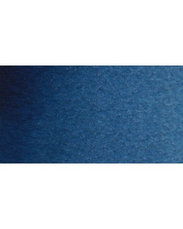
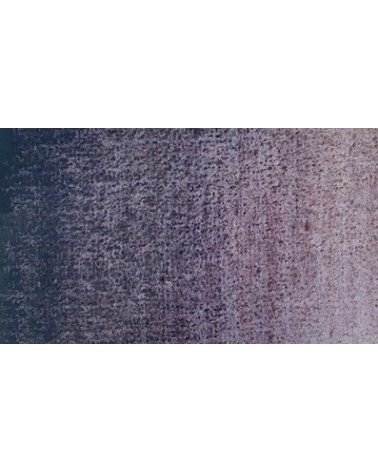
It is a dark blue, which corresponds to a dark reddish blue. It is ideal for nuancing cool colors like violets and blues by giving them more depth. Also useful for forming greens, especially with chartreuse yellow.
€6.95
€7.40
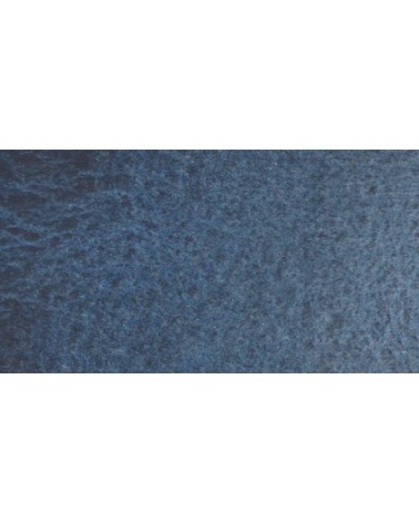
Gorgeous unique shade of gray blue.
€8.45
Un bleu à la teinte unique et légèrement iridescent. Il ravira les aquarellistes qui apprécient les effets et la granulation.
€8.45
I was inspired by the surprising reflections of a semi-precious stone: apatite.
This blue is grainy and iridescent. It is part of the 2022 Happy Precious Year collection.
€8.45
Ametrine is a quartz born from the union of citrine and amethyst which gives it very interesting reflections. I was inspired by the color of this mineral to create this purple which joins "other colors of the 2022 "Happy Precious Year" collection.
This color is grainy and iridescent.
€6.95
€6.95
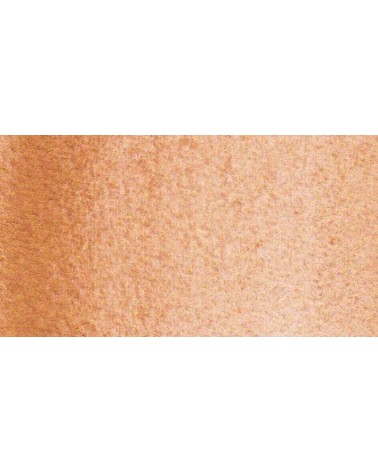
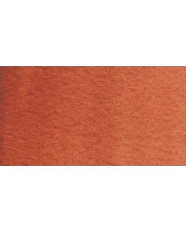
Magnificent red which turns brown. More transparent than burnt Sienna and less grainy, it can perfectly replace it for watercolorists who prefer a more transparent and reddish tone.
€6.95
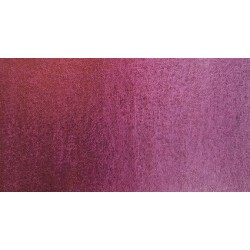
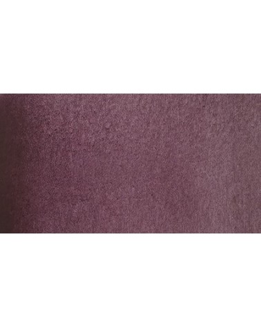
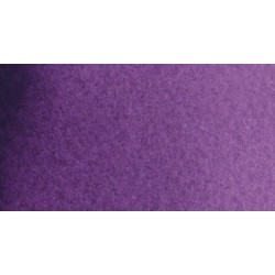
Dark mauve which can be lightened with Isaro pink and nuanced with overseas blue for example.
€6.95
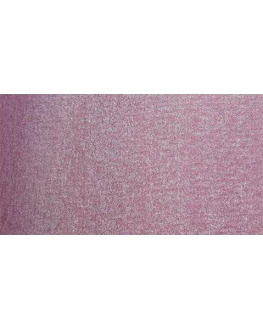
Very beautiful light mauve mono pigmentary and therefore a beautiful purity of tone. It can be lightened with Isaro pink and darkens with ultramarine blue or phthalo blue for example.