
Categories
Featured
Active filters
€16.00
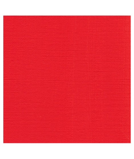
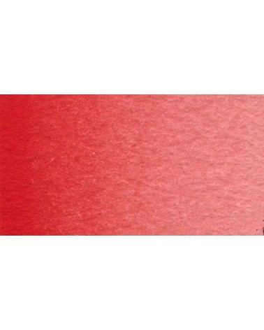
A beautifull and luminous red. More pinkish than the red cadmium light
€26.00
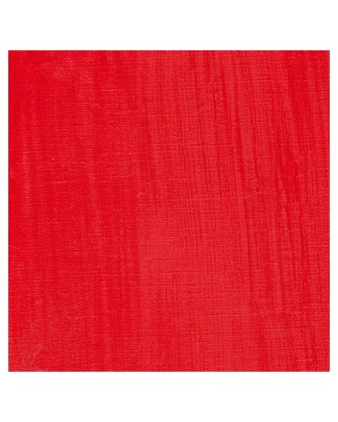
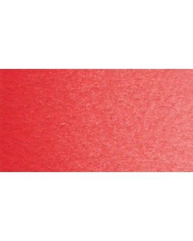
This pure and luminous bright red has a high tint power.
Cadmium red is obtained by replacing a tiny percentage of sulphur with selenium when combined with cadmium. This red has a very pure hue. So, mixed with white his undertone is red and not pink such as with organic reds.
€16.00
€26.00
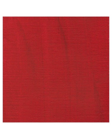
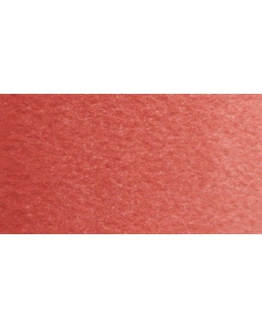
The deepest of the Isaro's cadmium range. This red have a slight hint of violet in its undertone
€16.00
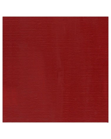
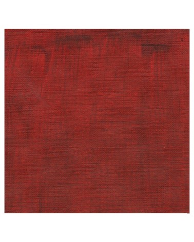
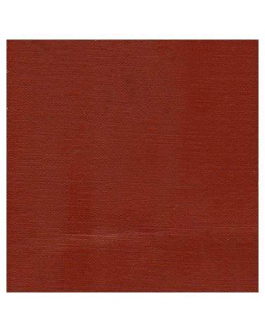
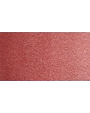
A dark red brown, very beautifull for glazings.

€8.45
€6.95
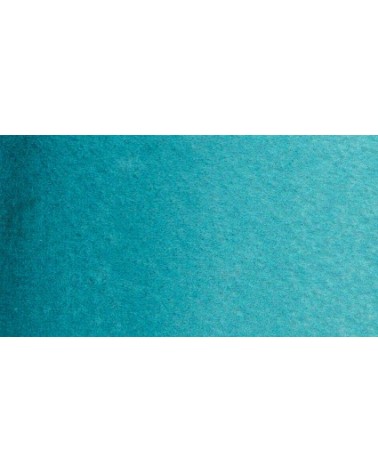
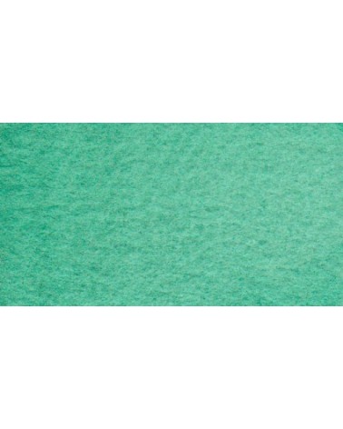
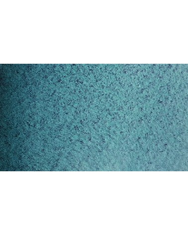
Based on blue and phthalo green, this turquoise is nuanced at will with blue or green.
€6.55
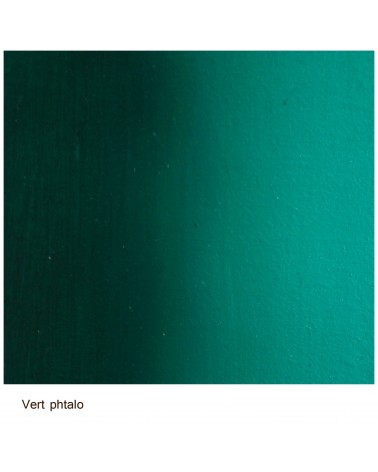
Bright and vivid green that can also be created on the palette by mixing using phthalo green PG7 or phthalo green yellow shade PG36; To the latter, lemon cadmium yellow or light cadmium yellow is added or, if it is desired to retain more transparency, light Isaro yellow PY154.
€6.55
Very beautiful green, turning blue. When mixed with phthalo blue, it gives a very nice range of turquoises. With the yellows to obtain a very wide range of greens. With the earths of earthy greens and with the burnt umber a dark green.
€6.55
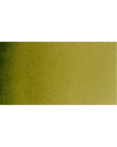
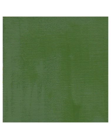
Green useful for landscapes in particular. Maybe nuanced with phthalo green or yellows.
€7.40
Very beautiful green tone less dynamic than phthalo green. The emerald green is bluish.
€6.55
Very beautiful earthy green and mono pigment.
€6.95
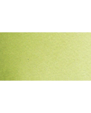
Magnificent bright green with an underlying shade of yellow.
€6.95
Vert Sapin
PG36 + PY165
€6.95
€7.40
Singular and grainy green color.
€8.00
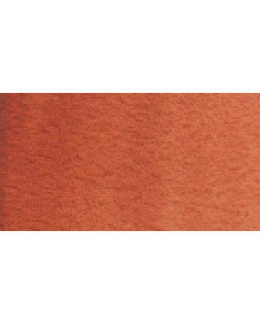
A rich and earthy burnt orange
€8.00
A rich and earthy burnt orange.
€14.00
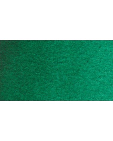
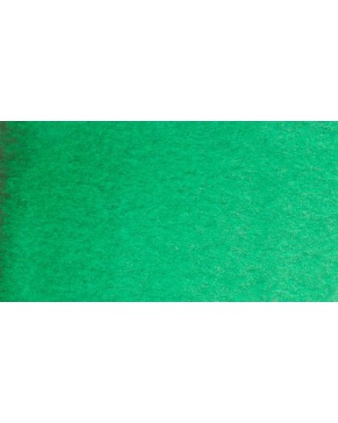
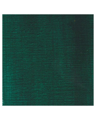
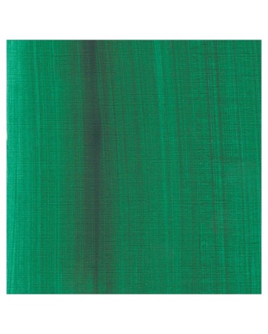
This vivid and strong bluish greens a good staple green to produce a large range of greens.
€22.00
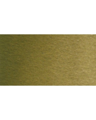
This earthy green is very Opaque.
Mixed with yellows or earths (ochre, umber, sienna), it produces a usefull range of greens for the landscapists
€12.00
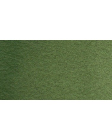
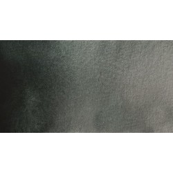
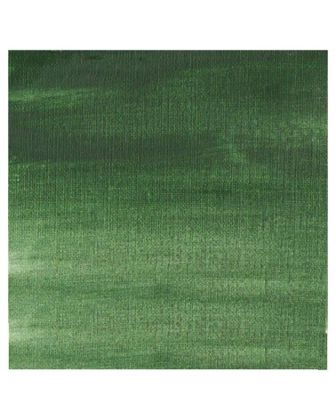
It's a deep brownish green.
€12.00
It's a beautifull green useful in producing glazes when diluted.
€26.00
This colour is more Transparent and less dull than chromium oxide green. Emerald green produces splendidly luminous green when mixed with cadmium yellow. Landscapists and some portraitists prefer it because his undertone is less vivid than the phtalo green.
€16.00
This Transparent iron oxyde with a orangey undertone is excellent for producing luminous and warm glazes.
€6.95
Magnificent red which turns brown. More transparent than burnt Sienna and less grainy, it can perfectly replace it for watercolorists who prefer a more transparent and reddish tone.
€8.45
Ametrine is a quartz born from the union of citrine and amethyst which gives it very interesting reflections. I was inspired by the color of this mineral to create this purple which joins "other colors of the 2022 "Happy Precious Year" collection.
This color is grainy and iridescent.
€7.40
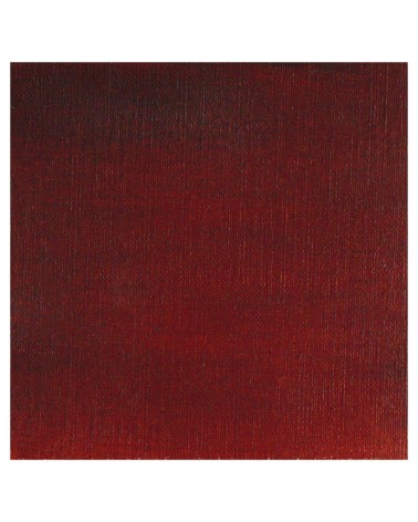
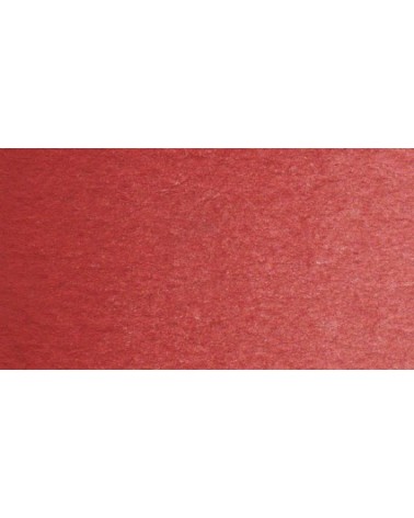
Very beautiful dark red tending to burgundy.
€6.95
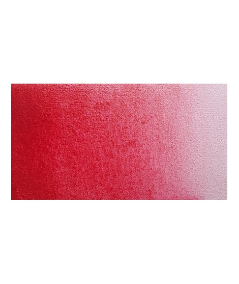
This very beautiful red whose shade can make one think of madder lacquer does not have the lack of stability over time.
With a little burnt umber, it is perfectly darkened and you easily get a crimson alizarin shade.
€6.95
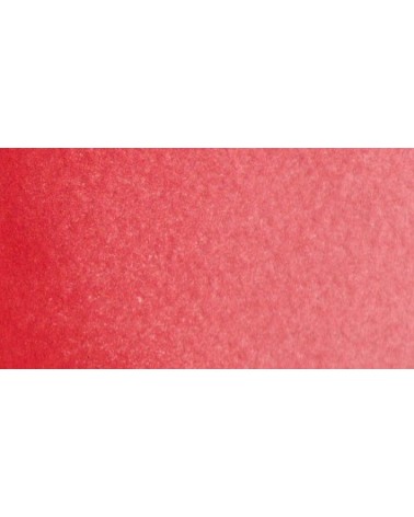
Very beautiful red, lively and bright with an underlying note colder than Scarlett red.
€6.95
One of the flagship colors at Isaro. Very popular with watercolorists, it is one of the essentials on a palette.
€7.40
This red has a great purity of tone. It draws very slightly on the yellow.
€3.95
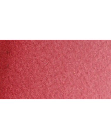
Very beautiful brick red, with an underlying shade of orange-yellow.
€3.95
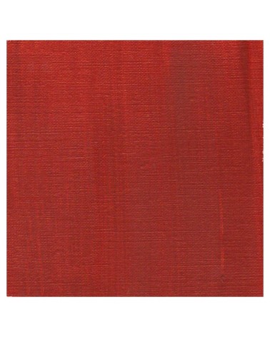
Very good brick red tone, with an underlying pink shade. Despite its relative opacity, this well-mastered color is appreciated by watercolorists.